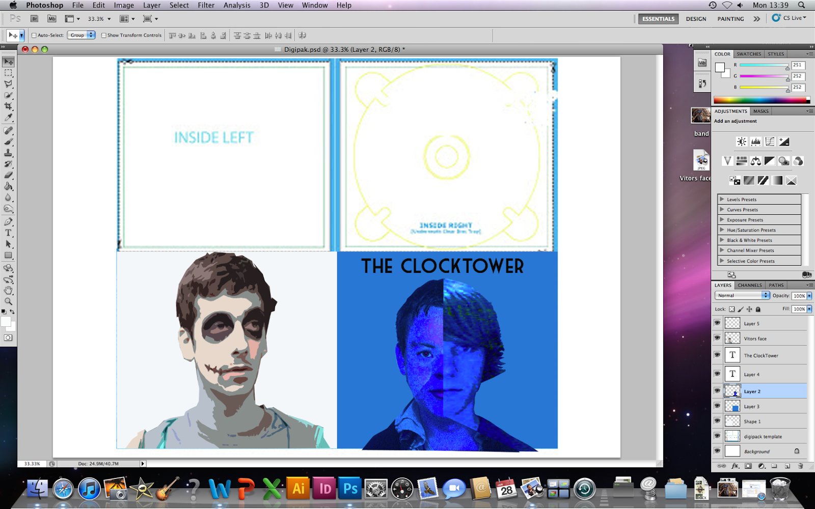
In response to the feedback I recieved for my mock digipak, I made changes to the inside of the digipak. The silhouttes have now been made black instead of green, to look more eye catching and attractive. I changed the colours of the CD as was suggested.

In response to feedback on my poster I changed my poster. I moved the "naughty little head" subtitle further down the page so it didn't overlap the image as it was suggested that it looked unproffessional. Also, to increase the proffessional look further I changed the colour of the text to black.


 In response to feedback on my poster I changed my poster. I moved the "naughty little head" subtitle further down the page so it didn't overlap the image as it was suggested that it looked unproffessional. Also, to increase the proffessional look further I changed the colour of the text to black.